
Brand Guidelines — v2.0 — 2026
The Estatelio identity, in one place.
Everything a designer, printer, developer, or partner needs to represent us correctly: positioning and voice, the logo and how to use it, the palette, the type system, and the rules we do not bend.
01 — Positioning
Access, not inventory
Estatelio is a boutique realty agency that represents people, not listings. We work the whole market through a network of trusted co-agents and sources, and we stay accountable for the result. Our advantage is judgement and access — the brand should feel like a firm that has seen a lot of deals and does not oversell.
One-liner
Boutique representation with the reach of the whole market.
Audiences
Buyers and sellers who want a person, not a portal · relocating households · cooperating agents looking for a reliable partner on the other side of a file.
Attributes
Composed · candid · well-connected · quietly premium. Never loud, never salesy, never luxury-cliché.
02 — Voice
We speak as a firm, in plain sentences
Always “we” — never “I”. Estatelio is a company with a network behind it, and the copy should read that way even when one person is doing the writing. Short declaratives. No hype adjectives. Name the trade-off before the client finds it.
Do
- “We'll come back with a shortlist and name the drawbacks.”
- “We work with co-agents so our clients see the whole market.”
- “If we're not the right fit, we'll say so early.”
- Numbers only when they are real and current.
Don't
- “I'll find you your dream home!”
- “Number one luxury agent — unrivalled, world-class service.”
- Exclamation marks, emoji, all-caps urgency.
- Invented stats, fake awards, borrowed logos.
Tagline
Every door worth opening.
Descriptor
Estatelio — Boutique Real Estate Representation
Naming
“Estatelio” in body copy. Never all-caps in running text — the logotype owns that.
03 — Logo
The wordmark is the logo
The final “io” resolves into a house: the roof grows out of the letters and the baseline rule closes the form. That idea is the whole asset. The roof never appears as a separate icon beside the name, and the name never appears without it.
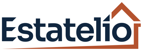
Primary — navy wordmark, clay house
Reversed — bone wordmark, clay house

Clearspace on all four sides equals the cap height of the “E”. Dashed line for reference only.
Minimum size 120px / 32mm wide. Below that the baseline rule thins out and drops off in print — use the monogram instead.
Single-colour navy for stamps, engraving, fax-quality print, and any one-ink application.
Never
- Stretch, skew, rotate, or outline the wordmark
- Re-set the name in another typeface
- Add shadows, gradients, or bevels
- Place it on a busy photo without a scrim
- Recolour it outside the palette in section 05
- Pair it with a second house icon or key graphic
04 — Monogram
The “E”, cut from the wordmark
Where the lockup will not fit — favicon, app icon, social avatar, stamped hardware — the mark is the capital “E” taken verbatim from the logotype, angled arm cuts included. It is not redrawn and not re-set: it is the same outline, so the monogram and the wordmark can never drift apart.
The house monogram from the original artwork is retired. Isolated from the wordmark it reads as “10” rather than “io”, and there is not enough clearance above the stem to add a tittle without crowding the roof.
Size test — 110 / 48 / 24 / 16px

Tiles — ready to ship


Navy is the default. Clay for a single accent placement. Bone only on navy or photographic backgrounds.
Construction
On a square tile the “E” occupies 53% of the height and sits 0.8 units above the geometric centre. A tall glyph centred by arithmetic always looks like it has slipped downward — the offset corrects for that.
Where it is allowed
Favicon, app icon, social avatar, email-signature tile, embossing, and as a section marker in documents. Never as a substitute for the logo in a header, footer, sign, or advertisement.
Never
Do not set the “E” in Sora, Newsreader, or any other typeface. Do not round its corners, add a roof above it, or enclose it in a circle. Do not letterspace it into a repeating pattern.
05 — Colour
Navy, bone, and one clay accent
Roughly 60% bone, 30% navy, 10% clay. Clay marks one thing per view — a call to action, an eyebrow, the roof. Never a second accent.
Note on the change: the original artwork paired the navy with a bright orange (#F58A00). Orange reads friendly but also budget — it is the colour of hardware stores and discount signage — and it works against the boutique positioning. Clay keeps the warmth at a lower volume and sits comfortably with the navy.
Navy
Bone
Clay
Linen
Clay light
Contrast
Clay on bone passes AA at 16px and above. On navy, use clay light for text and eyebrows; solid clay is for fills and rules only.
Navy → CMYK 100/80/40/40. Clay → Pantone 7599 C. Bone → warm uncoated stock, never coated gloss.
Borders
Hairline #DDD6C8 on bone, rgba(246,242,234,0.18) on navy. 1px only — no rounded corners and no shadows anywhere in the system.
06 — Typography
Newsreader and Sora
Sora stays, demoted: it carries interface text, labels, and buttons, where its geometry rhymes with the logotype. Headlines go to Newsreader — an open editorial serif with enough width to sit at large sizes without looking compressed. Both are free from Google Fonts.
Display — Newsreader, 400
Aa Bb Cc
1234567890 & ,.;:—“”
Headlines, pull quotes, section numerals. Regular weight only. Line-height 1.1–1.2, letterspacing between 0 and −0.005em. Never tighter — that is what made the first draft look squeezed.
Text — Sora, 300 / 500 / 600
Aa Bb Cc
1234567890 & ,.;:—“”
Body at 300, interface and labels at 500 or 600. Body 15–17px, line-height 1.8. Eyebrows and buttons uppercase, 11–13px, tracking 0.1–0.3em. Never letterspace Sora like the logotype.
H1 — Newsreader 90/1.1
Every door worth opening
H2 — Newsreader 52/1.16
Three ways clients work with us
Body — Sora 300 · 17/1.85
We work our sources and co-agent network, then come back with a shortlist — drawbacks named, not hidden.
Eyebrow / Button — Sora 600
Book a 15-minute call
Substitutions when the brand fonts are unavailable: Newsreader → Georgia; Sora → Helvetica Neue or system-ui. Never Times New Roman, never Arial in marketing.
07 — Elements
Squared edges, hairlines, generous air
Buttons
Zero border radius. Hover inverts the fill; no scaling beyond a 2px lift.
Numbering and rules
Sections numbered 01–0n in clay. Roman numerals for service cards. One clay rule per view, maximum.
Photography
Warm, natural light. Architecture, thresholds, doors, streetscapes, real people mid-conversation. Full-bleed or hard-edged rectangles — never rounded, never a stock handshake on white.
Layout
1240px max width, 40–56px gutters, 96–114px section padding. Cards butt together on shared hairlines instead of floating.
08 — Applications
How it shows up in the world
Business card — front and back
Name Surname
Broker Associate · Lic. #000000
hello@estatelio.com
estatelio.com
Email signature
— Kind regards,
Name Surname
Estatelio — Boutique Real Estate Representation
+0 000 000 0000 · hello@estatelio.com
estatelio.com
No quotes, no banner images, no “sent from my iPhone”. One clay element only.
Social avatar and post frame
One line of Newsreader on navy, or a full-bleed photo with a clay eyebrow. No price stickers, no “SOLD” starbursts.
Browser tab and compliance
Estatelio — Boutique Real Estate
- Brokerage name and licence number on every public asset, 11–12px.
- Equal Housing Opportunity line in the website footer and all print.
- Co-agent credited on any shared listing material.
- No claims of volume or ranking without documentation.
09 — Assets & open items
What to hand a developer
Logo files
brand/lockup.svg
brand/lockup-rev.svg
brand/lockup-mono.svg
Monogram files
brand/fav-e.svg (+ -bone, -clay)
brand/fav-e-tile-navy.svg
brand/fav-e-tile-bone.svg
brand/fav-e-tile-clay.svg
Master artwork
The supplied Illustrator SVGs export without colour definitions and render solid black in most software. Everything above was rebuilt with fills baked in as presentation attributes. Have the originals re-exported the same way.
Still needed
Brokerage name and licence number, service area, phone, languages, and the co-agent referral fee standard. All are marked as placeholders on the homepage.
Estatelio Brand Guidelines · v2.0
Questions on usage: hello@estatelio.com